A new wave of colour psychology research links what we reach for on the rail to stable patterns in personality. One 2022 paper in a leading psychology journal profiled 854 adults and found a clear preference story: people who chose blue more often tended to score higher on traits tied to disciplined thinking and steadier emotions. That link does not label anyone’s intelligence, yet it nudges an everyday question: what does your colour pick signal about how you think?
What the data says
Researchers in South Korea asked adults aged 20 to 60 to complete a Big Five personality questionnaire alongside a colour–adjective task. The goal was simple. Map preferences to broad traits, then test how strongly those patterns hold across a large sample.
The strongest link sat with blue. Participants who reported favouring blue showed higher levels of conscientiousness. In practical terms, that trait signals reliability, organisation and a preference for careful planning. The same group also showed signs of greater emotional stability, a quality that supports calm decision-making when stress rises.
In a sample of 854 adults, a preference for blue tracked with higher conscientiousness and steadier moods.
How the study measured personality
The team used the Big Five model: openness, conscientiousness, extraversion, agreeableness and neuroticism (often expressed as its opposite, emotional stability). They then examined how self-declared colour preferences aligned with these dimensions. The result is not a diagnostic tool. It is a population-level pattern that adds context to everyday choices.
| Linked pattern | Practical reading |
|---|---|
| Preference for blue | Higher scores on conscientiousness; calmer affect under pressure |
| Short-wavelength hues (cool palette) | More inward attention and reflective focus reported by participants |
| Broad colour–trait mapping | Preferences align with personality at group level, not as an individual test |
Why blue may appeal to analytical minds
Blue sits at the short-wavelength end of the visible spectrum. People often describe it as cool, ordered and soothing. The researchers suggest that those who habitually direct attention inward gravitate to such tonal qualities. That inward tilt often accompanies reflective thinking and methodical analysis.
Colour specialists make a similar case in plain language. Consultant June MacLeod argues that colour transmits energy the body registers. She notes that sensitivity to colour can persist even without vision, which hints at a deeper, multisensory response. Philosopher Alain de Botton has framed blue as a signal of discipline and quiet resolve, a colour that sticks to the task and resists distraction. These cultural readings match the data’s direction of travel.
Blue signals order and steadiness in many cultures, and the data shows a matching personality pattern.
Correlation, not destiny
This is a correlation, not a hierarchy. Wearing blue does not raise your IQ. Equally, a preference for red or green does not lower it. The finding describes where tendencies cluster across many people. Your own history, culture and taste also shape what you pick in the morning.
What this means for your clothes and spaces
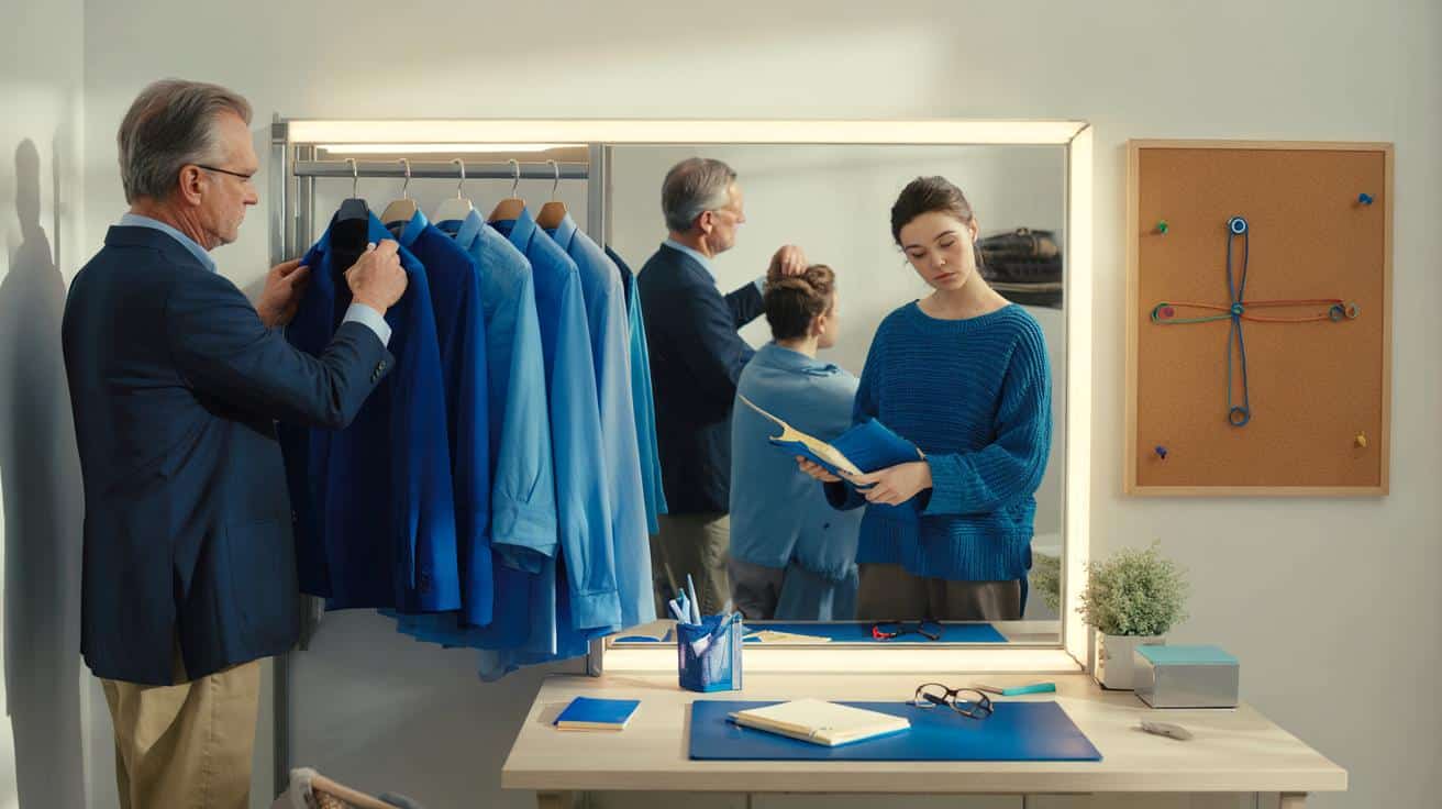
Colour choices can support the way you want to work, lead or learn. If blue helps you feel composed and on-task, weaving it into routine can give a small yet steady edge.
Practical ways to use the insight
- High-focus days: pick a navy shirt, a blue tie, or a cobalt knit to anchor attention during complex tasks.
- Stressful meetings: reach for muted blues to steady breathing and pace your responses.
- Study zones: add a blue notebook, desk mat or background to reduce visual noise.
- Digital setup: select a cooler wallpaper or accent colour to signal a shift to deep work.
- Sleep routine: keep vivid blues out of the bedroom lighting late at night; soft, desaturated tones suit wind-down.
Use colour as a cue, not a crutch: small, consistent signals can shape habits and focus across the week.
How to test the effect on yourself
You can run a simple seven-day check. On three days, add a clear blue item (clothing or a desk object). On three days, avoid blue entirely. Keep one day neutral. Each evening, rate focus, stress and task follow-through on a 1–10 scale. Look for patterns rather than perfection. If blue days trend higher for calm and completion, you have a personal signal worth keeping.
Signals to watch
- Focus depth: how long you stayed with one task before switching.
- Error rate: how many corrections you had to make on routine work.
- Stress spikes: moments of tension and how quickly you settled.
- Social tone: whether your interactions felt measured or rushed.
What about culture and context
Colour carries cultural meaning. Blue may read as trust and competence in one setting, or formality and distance in another. Industries also set codes: finance leans to navy, creative fields accept bolder palettes. Match the setting first, then tune the shade for your goal.
Beyond clothes
The same logic works in spaces and tools. Meeting rooms with cooler accents feel calmer and more procedural. A fast brainstorm might benefit from a warmer accent to raise energy, then a move to a blue-toned corner to settle into execution.
What experts add to the picture
Colour therapists and philosophers approach the subject from different angles, yet their views can complement the data. MacLeod’s energy lens underlines the embodied side of colour. De Botton’s account of blue as ordered, resilient and self-possessed echoes the conscientious profile found in the research. These are interpretations, not lab results, yet they help many people translate data into day-to-day choices.
Personality shows through pattern and preference. Colour is one of the simplest patterns you control.
Extra context you can use
Think in layers. You can pair blue with textures that match your aim: crisp cotton for structure, soft knit for warmth, matte finishes for quiet focus. If you rely on blue daily, add small contrasts to avoid monotony: a charcoal jacket, a white notebook, or a muted green plant. Balance keeps the signal fresh.
There are limits and risks. Over-reading colour can lead to snap judgments about others. Use it to steer your own habits first. If you manage a team, invite people to shape their work settings through simple, reversible colour cues, then check for effects on concentration and stress across a month. Gains here are modest yet repeatable, and that consistency is where blue’s reputation for disciplined thinking earns its place.


